 |
C&C Remastered : Premier Aperçu de l'interface + infos |
 |
Jim Vessela revient vers nous avec une première image de la nouvelle interface ainsi que quelques informations.
Citation de ses mots : (en anglais)
Fellow Command & Conquer fans,
We have concluded our Pre-production phase and are now formally into Production. The art team at Lemon Sky is in full swing creating 4k content, and Petroglyph is continuing to stand up more features every week. Multiplayer is now playable for Tiberian Dawn, and we even had a chance to show the software to the Community Council a few weeks ago. Overall this transition into Production is a big milestone for any project, and we’ve been humbled by all the support thus far.
For this post, we wanted to share our approach to the in-game UI, and provide a sneak peek to our current in-progress version. Back when we announced the game in November, the UI was one of the key areas many of you in the community had passionate discussions about. As such, we listened to your videos, read comments from across the sites, and brainstormed with the Community Council. The trend we heard is that you still wanted the classic C&C Sidebar UI, but would welcome updates to the legacy UI to help the usability experience.
So with that in mind, one of the most requested improvements was to reduce the need for scrolling the Sidebar as much as possible. A key suggestion on how to accomplish this was to introduce the build tabs from Red Alert 2 and Tiberium Wars into the classic UI. We have thus decided to embrace this suggestion, and you can see the build tabs present in the associated preview image. However, because of the construction queue rules of the original games, we wanted to keep all buildings under a single tab, with associated tabs for Infantry, Vehicles (Air, Land, Naval), and Support Powers. To further support the goal of reduced scrolling, we have then designed the Sidebar to fit 18 build buttons. The combination of these elements means you’ll need to scroll much less, and along the way will benefit from many of the modern feedback elements of more recent C&C titles.
In terms of cosmetic design, we wanted the UI to follow our overall project direction of keeping elements authentic to the legacy version. We’ve done our best to capture the visual spirit of Tiberian Dawn, and or course would embrace a similar approach for Red Alert. We are recreating the build buttons in the spirit of the Gold Edition style, and again aiming to keep these as authentic as possible to the original design while preparing them for a 4k experience. Other updates include replacing the Repair, Sell, and Map buttons for icons to support our eventual localization efforts. And we’ve also shifted the Money and Options sections to above the radar map to ensure optimal screen allocation for the battlefield. All of these changes are done in the aspiration of keeping the spirit of the legacy Sidebar, while optimizing for a modern RTS gameplay experience.
Given the ongoing amount of passion around this UI topic, we are certainly eager to hear your thoughts in the comments, and looking forward to making the best UI experience possible for C&C Remastered.
Cheers,
Jim Vessella
Jimtern
Globalement, il dit qu'ils ont terminé la phase de pré-production et qu'ils sont officiellement en production. Qu'ils bossent à fond pour créer du contenu 4K et que Petroglyph continue à développer de plus en plus de fonctionnalités chaque semaine. Le multijoueur est déjà jouable et ils en ont fait une présentation au Conseil Communautaire il y a quelques semaines.
Après avoir écouté les retours des joueurs de manières diverses, ils en ont conclu que les joueurs voulaient conserver l'interface utilisateur telle qu'elle l'était en 1995. Latérale droite, avec le même système d'icônes. Tout en gardant ça en tête, ils ont tout de même cherché à réduire au maximum le besoin d'utiliser la roulette pour circuler d'un choix à un autre, en s'inspirant de l'interface utilisateur d'Alerte Rouge 2 et Soleil de Tibérium (ndlr : Très bon choix pour ma part). Ils ont fait en sorte que le tout soit cohérent en faisant des choix d'alignement sur un seul niveau tout en faisant en sorte que le design tourne autour de l'idée de se limiter à 18 boutons. Le tout permettant de moins se casser la tête à scroller en permanence.
Niveau design, ils ont toujours pour objectif de respecter la version originale et ont l'intention de suivre le même cahier des charges pour le futur Alerte Rouge Remaster. Les boutons ont été recréés en conservant l'esprit d'origine, tout en les préparant à une experience 4K. Ils vont continuer à bosser le design (Il cite les boutons "réparer", "vendre" et "map" . L'argent et le bouton options ont été déplacés au dessus du radar, toujours dans l'idée de laisser un maximum de place pour la vision du champ de bataille. Ils continueront à suivre les retours des joueurs afin de faire de ce remaster, le meilleur possible. . L'argent et le bouton options ont été déplacés au dessus du radar, toujours dans l'idée de laisser un maximum de place pour la vision du champ de bataille. Ils continueront à suivre les retours des joueurs afin de faire de ce remaster, le meilleur possible.
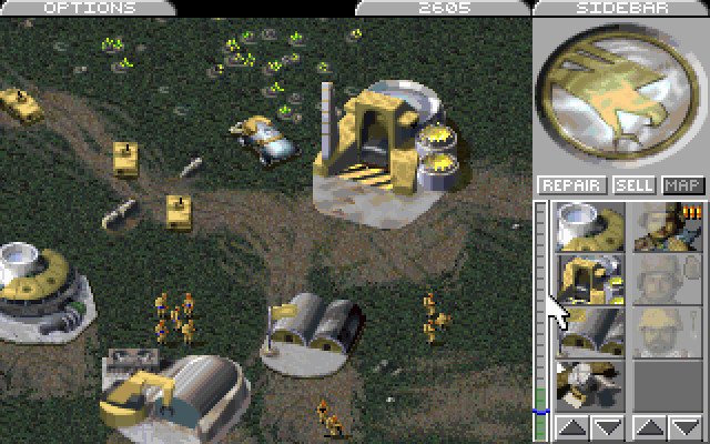
Voici respectivement la nouvelle et l'ancienne interface afin de vous faire une idée : (Sujet à changements avec l'évolution du développement)
(Cliquer pour zoomer)
En espérant en voir un peu plus à l'E3. Perso j'aime ces changements.
Psychoyuri
|


